We launched a beta version of responsive PSD to Bootstrap conversion. Bootstrap 3.3.7 is used for the automated conversion.
We support desktop first approach, i.e. we take as input a template developed for the desktop. Then graceful degradation is performed for smaller screens.
Responsive PSD to Bootstrap conversion is more sensitive to the preliminary template preparation then other types of conversions performed by the service. Namely, following things should be taken into account:
- Content width should be one of the following: 720, 750, 940, 970, 1140, 1170 pixels (correspondingly, container width will be 750, 780, 970, 1000, 1170, 1200 pixels). As content we treat all the layers except those which have width of the template (i.e. except full length backgrounds). Template itself may have any width.
- Layers should be positioned according with the grid. The more precise positioning is the better.
- It is highly desired for the layers to be grouped logically into rows and columns.
We continue improving PSD to Bootstrap conversion. If you have any ideas, proposals or comments regarding the way how Bootstrap template is generated – please, share them with us. That will help us to implement the most requested functionality quicker.
Examples
You can find several examples of automatically generated Bootstrap templates below:
- miami_home.psd
miami_home code.zip
miami_home online demo - notify_psd_theme.psd
notify_psd_theme code.zip
notify_psd_theme online demo
Resources
It is quite handy to use Photoshop Guide Layouts when developing PSD design for Bootstrap. If you did not use it before, you may download Bootstrap Guide Layouts for different screen sizes below. You can either download them all or only specific ones:
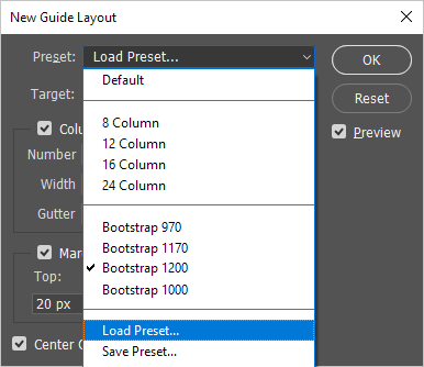
In order to use them you should select menu item View -> ‘New Guide Layout…’. In Preset field choose ‘Load Preset…’:

Once Guide Layout is enabled, Photoshop will help you with precise positioning of layers according to the Bootstrap grid.
